Hey all - I need some CSS assistance (“cssistance”?) with logo alignment and behaviour in a grid view.
I currently have 20 logos in a 2-row grid (when viewed on large screens), sized to image-style scale width to 70px . Using Mozilla Web Developer tool thing, I can see the logos have also been resized to 10% in this wide-screen grid view.
Question #1
How do I get each logo to align centrally and vertically in its ‘cell’? Currently they seem to be aligning left and top. At the very least, horizonal-left + vertical-middle align is fine, if centered is not possible.
Question #2
When viewed on a smaller screen (ie @media, i think?), how can I break the grid so the images stay at 10% size (as they are on wide-screen) and have multiple rows of (say) 4 images, rather than the whole lot going into 20 rows/single column and increased size?
How about using a table (the default one from drupal) ? that would make it easier for you to manage and amend these logos in future as well. Also to add the table would be responsive so no work on you to add any additional CSS to make it responsive.
If not then we can help you with the CSS so as to achieve the desired output.
Chiming in on this: If you have images in a table, enforcing vertical and horizontal positioning of images within each cell (you can do all of this with inline styling) is probably easier to manage. Of course, it is worth remembering that under the hood you also have access to Bootstrap which features excellent grid-based solutions for responsive design. Also, I note that your images have many different sizes, colours (including background colours), and qualities. It might be worth spending some time ensuring some consistency here.
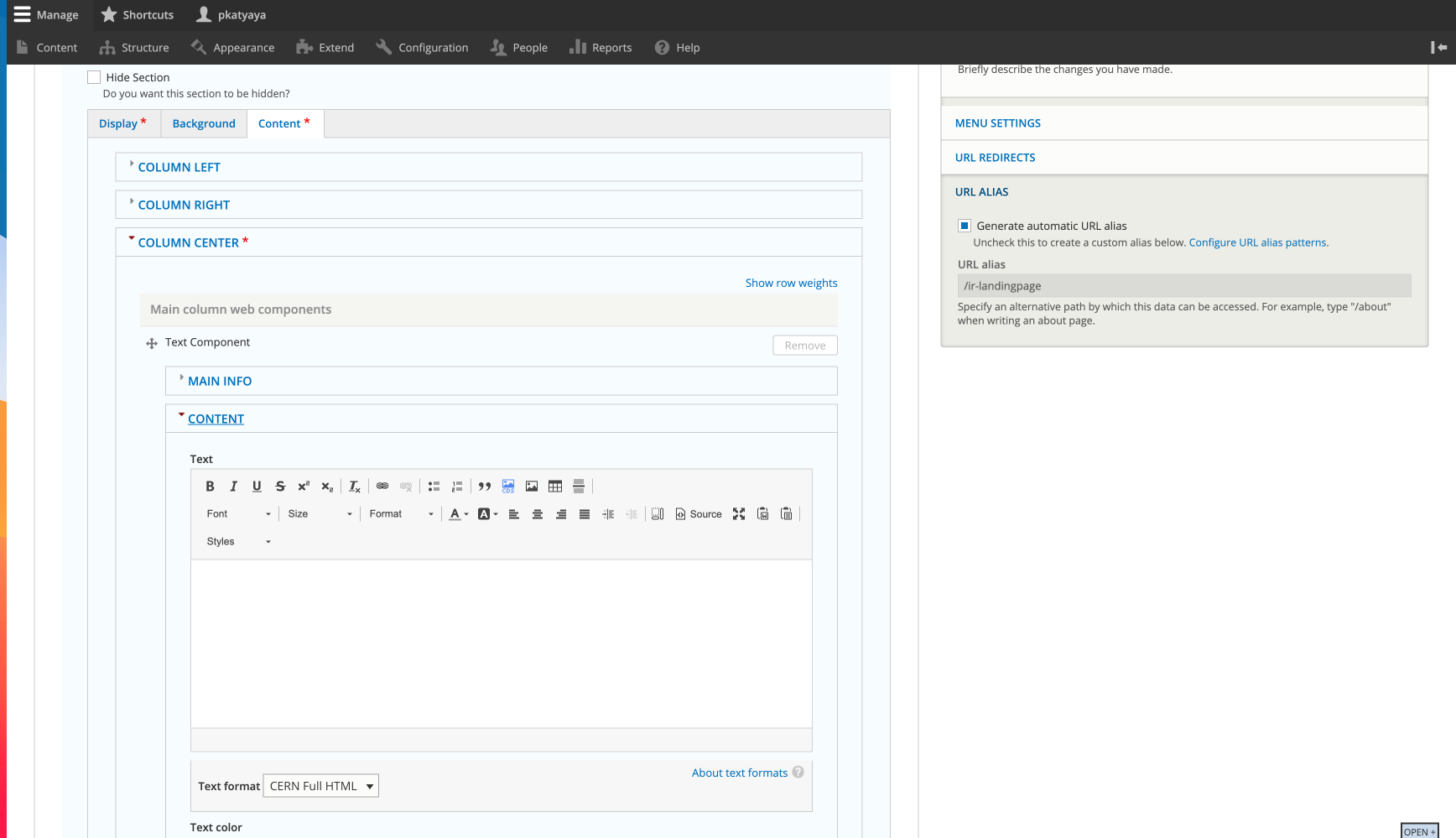
However I can’t work out how to make a default table with the logos in any kind of columns in the View. It’s just showing up as a single column of 20 rows… am I missing something in the configuration?
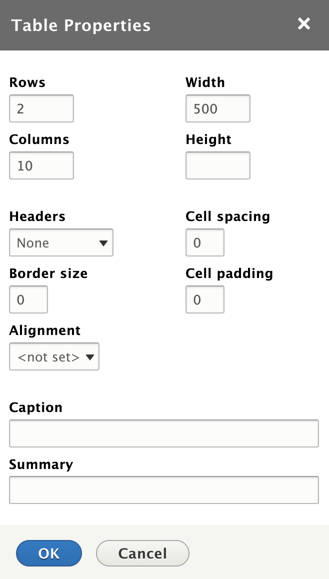
In there add a table with 2 Rows and 10 Columns. You can opt for other table properties such as spacing, padding, border etc. (Refer the Screenshot below)
Having completed these above mentioned steps you can do further customisation to your table from the source of the body by adding custom CSS to the table. Ex: Height, width, Padding, links etc.
Thanks Prakhar - this is certainly useful! I hadn’t realised we could go in via the Landing Page and create a standard html table (makes sense though…!)
However I was rather hoping to use a View, as these images are attached to content. One of the things we wanted to avoid this time was precisely having to spend time on image manipulation (when we could use image styles), then upload 20 images in several different locations…
@joachim has suggested Bootstrap, I’m going to investigate that today and see what we can do with it. Indeed - agreed - the images are inconsistent; this was simply the ‘first pass’ at uploading with what I have at the moment, to see what needs correcting. Fingers crossed Bootstrap can provide a bit more of what I need out of the box…
I’m afraid not so far. I installed various modules for Bootstrap (Bootstrap, Bootstrap Layouts and Views Bootstrap), but couldn’t get any further than a single column display of 20 rows, no matter what configuration I set for rows/columns/linebreaks etc. It looked very promising, like exactly what I needed, but ultimately it just didn’t function at all.
There will be 3 separate places requiring the 20-image set, so it really needs to be Views as the basis for whatever happens next.
I see. Have you considered using Bootstrap directly via HTML? You can tap into the grid layout (see https://getbootstrap.com/docs/4.1/layout/grid/ for more information) to create the general structure and apply generic styling to the contents inside. If you further edit the images to be of similar size (preferably the exact same), it should be fairly easy to get a proper, responsive display.