Hi WebTeam!
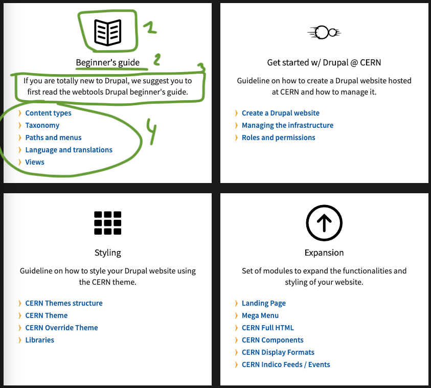
I found out there is a component I would really like to use, since most of the websites we have to migrate in our team use a similar pattern. I am referring to these boxes with an icon1, category2, short description3 and links collection4 on this page of the WebTools site:
https://webtools.web.cern.ch/technologies/drupal
Is it available somewhere? I implemented something similar on the new Procurement website (https://test-procurement-d8.web.cern.ch/) for the navigation on the main pages, but it required a lot of theming and a complex combination of views to make it work (I wanted to make it maintainable for the final users so I didn’t want to create countless menus or another content-type).
If this pattern was included on the CERN theme, it would be very useful to my team, since we could implement secondary navigation using it 
Please let me know!
Thanks, and regards,
Óscar
Hello Oscar,
Yes of course you can use this style. Unfortunately I dont have them in the form of a component ( even though it would be actually a good idea to have them!). What we do is that we use it in a custom block, not the best solution but it works in our case.
I append the code below. You can either add it straight-away in a custom block (like we do) or add it as style of content type by adding the HTML part of it as a twig template and the CSS just append it in your theme styles.
Then by creating a view that displays items of this content type you can create a page/block etc. and display your items.
Let me know if you have more questions.
Konstantinos
Styles
HTML
<div class="components-boxes">
<div class="components-boxes-box">
<div class="icon-box-wrapper"><font face="CERNIcons, CernIcons, cern-icons">^</font></div>
<div class="components-boxes-category">Beginner's guide</div>
<div class="components-boxes-subtitle">If you are totally new to Drupal, we suggest you to first read the webtools Drupal beginner's guide.</div>
<div class="components-boxes-link"><a href="/technologies/drupal/beginners-guide/content-types">Content types</a></div>
<div class="components-boxes-link"><a href="/technologies/drupal/beginners-guide/taxonomy">Taxonomy</a></div>
<div class="components-boxes-link"><a href="/technologies/drupal/beginners-guide/paths-and-menus">Paths and menus</a></div>
<div class="components-boxes-link"><a href="/technologies/drupal/beginners-guide/languages">Language and translations</a></div>
<div class="components-boxes-link"><a href="/technologies/drupal/beginners-guide/views">Views</a></div>
</div>
<div class="components-boxes-box">
<div class="icon-box-wrapper"><font face="CERNIcons, CernIcons, cern-icons">l</font></div>
<div class="components-boxes-category">Get started w/ Drupal @ CERN</div>
<div class="components-boxes-subtitle">Guideline on how to create a Drupal website hosted at CERN and how to manage it.</div>
<div class="components-boxes-link"><a href="/technologies/drupal/get-started-with-drupal/create-drupal-website">Create a Drupal website</a></div>
<div class="components-boxes-link"><a href="/technologies/drupal/get-started-with-drupal/infrastructure">Managing the infrastructure</a></div>
<div class="components-boxes-link"><a href="/technologies/drupal/get-started-with-drupal/roles">Roles and permissions</a>
</div>
</div>
<div class="components-boxes-box">
<div class="icon-box-wrapper"><font face="CERNIcons, CernIcons, cern-icons">G</font></div>
<div class="components-boxes-category">Styling</div>
<div class="components-boxes-subtitle">Guideline on how to style your Drupal website using the CERN theme.</div>
<div class="components-boxes-link"><a href="/technologies/drupal/styling/drupal-themes-structure">CERN Themes structure</a></div>
<div class="components-boxes-link"><a href="/technologies/drupal/styling/cern-theme">CERN Theme</a></div>
<div class="components-boxes-link"><a href="/technologies/drupal/styling/cern-override-theme">CERN Override Theme</a></div>
<div class="components-boxes-link"><a href="/technologies/drupal/styling/libraries">Libraries</a>
</div>
</div>
<div class="components-boxes-box">
<div class="icon-box-wrapper"><font face="CERNIcons, CernIcons, cern-icons">\</font></div>
<div class="components-boxes-category">Expansion</div>
<div class="components-boxes-subtitle">Set of modules to expand the functionalities and styling of your website.</div>
<div class="components-boxes-link"><a href="/technologies/drupal/expansion/web-components">Landing Page</a></div>
<div class="components-boxes-link"><a href="/technologies/drupal/expansion/mega-menu">Mega Menu</a></div>
<div class="components-boxes-link"><a href="/technologies/drupal/expansion/cern-full-html">CERN Full HTML</a></div>
<div class="components-boxes-link"><a href="/technologies/drupal/expansion/cern-components">CERN Components</a></div>
<div class="components-boxes-link"><a href="/technologies/drupal/expansion/cern-display-formats">CERN Display Formats</a></div>
<div class="components-boxes-link"><a href="/technologies/drupal/expansion/cern-indico-feeds">CERN Indico Feeds / Events</a>
</div>
</div>
<div class="components-boxes-box">
<div class="icon-box-wrapper"><font face="CERNIcons, CernIcons, cern-icons">=</font></div>
<div class="components-boxes-category">How To</div>
<div class="components-boxes-subtitle">Useful how to articles</div>
<div class="components-boxes-link"><a href="/technologies/drupal/how-to/how-replicate-views-home-website">Replicate the views of the Home website</a></div>
<div class="components-boxes-link"><a href="/technologies/drupal/how-to/how-create-responsive-tables-drupal-8">Create responsive tables on Drupal 8</a></div>
<div class="components-boxes-link"><a href="/technologies/drupal/how-to/how-render-node-pages-home-website">Render Full Content display as on Home website</a></div>
<div class="components-boxes-link"><a href="/technologies/drupal/how-to/how-add-format-icon-preview-card-component">Add a format icon in a Preview Card component</a></div>
<div class="components-boxes-link"><a href="/technologies/drupal/how-to-use-external-libraries">How to use external libraries</a></div><a> </a>
<div class="components-boxes-link"><a href="/technologies/drupal/how-to/how-create-feeds">Feeds for automated content creation</a></div>
<div class="components-boxes-link"> </div>
</div>
<div class="components-boxes-box">
<div class="icon-box-wrapper"><font face="CERNIcons, CernIcons, cern-icons">:</font></div>
<div class="components-boxes-category">Useful Links</div>
<div class="components-boxes-subtitle">List of useful links related to Drupal issues.</div>
<div class="components-boxes-link"><a href="https://drupal-community.web.cern.ch/">Drupal community forum</a></div>
<div class="components-boxes-link"><a href="https://gitlab.cern.ch/web-team/drupal">Web Team's Official Gitlab repositories</a></div>
<div class="components-boxes-link"><a href="https://mattermost.web.cern.ch/it-dep/channels/drupal">Drupal Mattermost channel</a></div>
<div class="components-boxes-link"> </div>
</div>
</div>
SCSS
.components-boxes{
      display: -webkit-box;
      display: -moz-box;
      display: -ms-flexbox;
      display: -webkit-flex;
      display: flex;
      -webkit-align-items: stretch;
      -moz-align-items: stretch;
      -ms-align-items: stretch;
      align-items: stretch;
      -webkit-justify-content: flex-start;
      -moz-justify-content: flex-start;
      -ms-justify-content: flex-start;
      justify-content: flex-start;
      -ms-flex-pack: flex-start;
      -webkit-flex-wrap: wrap;
      -moz-flex-wrap: wrap;
      -ms-flex-wrap: wrap;
      flex-wrap: wrap;
      margin: 50px 0 0;

      .components-boxes-box{
        font-size: 1.6rem;
        background: #ffffff;
        margin: 0 1% 20px;
        padding: 36px 25px 25px;
        position: relative;
        width: 23%;

        .components-boxes-icon{
          height: 54px;
          margin: 0 auto 15px;
          text-align: center;
          width: 54px;
        }

        .components-boxes-category{
          font-weight: bold;
          font-size: 1.8rem;
          color: #191919;
          text-align: center;
          width: 100%;
          line-height: 18px;
          font-family: unset;
          margin: 0 0 15px;
        }

        .components-boxes-subtitle{
          color: #191919;
          text-align: center;
          margin-bottom: 20px;
        }


        .components-boxes-link{
          font-size: 1.5rem;
          line-height: 18px;
          margin: 0 0 5px;
          padding: 0 0 0 17px;
          font-family: "Source Sans Pro";

          a{
            color: #0855a0;
            position: relative;
            text-decoration: none;
            font-family: 'sourcesans-semibold';

            &:hover{
              &::before{
                left: -23px;
              }
            }


            &:before{
              -webkit-transition: all 0.3s ease-in-out 0s;
              -khtml-transition: all 0.3s ease-in-out 0s;
              -moz-transition: all 0.3s ease-in-out 0s;
              -ms-transition: all 0.3s ease-in-out 0s;
              -o-transition: all 0.3s ease-in-out 0s;
              transition: all 0.3s ease-in-out 0s;
              font-size: 34px;
              font-size: 3.4rem;
              content: '\j';
              color: #f3a530;
              float: left;
              font-family: 'cern-icons';
              display: block;
              position: absolute;
              left: -28px;
            }

          }

        }
      }
    }
Hi @kplatis,
thanks for the full explanation 
Yes, I was asking for it to be included in the CERN theme so I don’t have to create the templates, theming and content types myself. It could be included as a pattern to choose from, where the links would be a multi-valued Link field.
Of course if I have time to implement it this way myself I will share it, but for the moment I am afraid I don’t have much development time on my hands  (at least during working hours LOL)
Thanks a lot anyway, hopefully this is useful to other developers as well
Hello Oscar and Konstantinos,
I will be also interested to have this component available in the CERN theme.
Let me know if you think do it.
Michel
As agreed with @michel.combe, I am sharing my guide on the way I implemented this just for the sake of knowledge transfer and to help other Drupal developers in similar situations, to give some insights about how to tackle this kind of problems.
 Disclaimer: I don’t recommend this approach since maintenance down the line can get tricky for non-experienced Drupal developers.
The objective:
Navigation boxes with several links inside them (see https://test-procurement-d8.web.cern.ch/):
 Every thumbnail is a taxonomy term. Blue veil + image zoom on hover [CSS]
 The link is the term’s name linking to the term’s page
 The list of links are nodes related to this taxonomy term. They appear also on hover [CSS]
The setup:
-
Create a taxonomy for navigation. It can be hierarchical. Let’s name it ‘Navigation’.
-
Optionally, add an image field to terms of that vocabulary, for the navigation boxes image. Let’s call it ‘Thumbnail’.
-
Add a term reference field on other content types to reference terms on this vocabulary. Let’s call it ‘Navigation’ as well. This is what makes the nodes appear inside the navigation boxes.
-
It must list terms from the ‘Navigation’ vocabulary
-
Set it to accept a contextual filter of type ‘Taxonomy term: Term Parents’. This will allow us to create boxes for every one of the children terms of a particular term.
-
Add the ‘Taxonomy term: Term ID’, ‘Taxonomy term: Name’ and the ‘Taxonomy term: Thumbnail’ fields to the fields of our display.
-
Choose the Grid format, and the Pattern display. On the Pattern Settings, choose Preview Card. Now add the ‘Taxonomy term: Name’ field to the ‘Title’ DESTINATION and 'Taxonomy term: Thumbnail to the ‘Listing CDS Image’ DESTINATION. We can leave the term’s ID out of the pattern areas, we will use it later.
Testing the view outside the admin theme should render regular Preview Cards showing your taxonomy terms.
-
Create a content view (let’s name it ‘Related Content’), and an entity reference display (let’s say named ‘Link by TID’). This display accepts the contextual filter ‘Content: Has taxonomy term ID’, and shows nodes of every content type that can reference terms on the ‘Navigation’ vocabulary.
- At this point it’s up to you to decide what you show inside the navigation boxes. For me the title linked to the original node and an edit link for editors worked just fine, but anything is possible.
-
Now, on the ‘Navigation’ view you need to add a views field to include the related content on every navigation box. For this you need the Views Field View module: https://www.drupal.org/project/views_field_view. This module is a little buggy so you have to have a little patience to get it to work.
-
Add a ‘View’ field (listed under the Global category) to your fields. Select the ‘Related Content’ view on the field’s settings, and the ‘Link by TID’ display. Don’t worry if it crashes and gives some stupid errors, you just need to insist, maybe setting a field at a time, and applying until it’s set up.
-
I renamed the administrative name on this field to ‘Related Content’ so it’s easier to maintain in the future.
-
Last step is to add the contextual filters for this display. For this, we will use the ‘Taxonomy term: Term ID’ field’s value from the replacement patterns. It boils down normally to something like {{ raw_fields.tid }}
Important: use the raw values whenever possible, since the contextual filter needs to receive the TID as a plain number. Spaces or any other characters will make it fail.
-
Now you just need to map the new ‘Related Content’ views field to the area on the Preview Card that works for you, using the Pattern Settings. I added mine on the ‘Date’ DESTINATION.
-
 That’s it, the view now shows preview cards showing related content. There are two ways you can use it:
-
Using it as the default view for your ‘Navigation’ vocabulary: for this you require one more module: Taxonomy Views Integrator: https://www.drupal.org/project/tvi
This will allow you to show these navigation boxes instead of the default’s Drupal listing for terms, every time you visit a term’s page. Cool stuff!
-
Adding it manually on landing pages using the Views Content field on the Section paragraph: you will need to supply the parent term’s TID for the navigation boxes to show up.
Depending on your site’s setup you might not even need this. In my case I had two levels of navigation so I used 4 different landing pages that spawn the ‘Navigation’ view with the TIDs of the 4 ‘Navigation’ vocabulary root terms.
You will have notice that, even though it works, it looks like crap. Of course, since the Preview Card component was never designed to do this. 
I themed up everything with extensive CSS after building my views and taxonomies. I can share the theme, but it might be very specific for my case and you might need to rewrite it.
I will create a feature ticket to implement it in a component and I will update the post
This is really a good news, thanks Konstantinos