Hello,
I created a website usinh the CERN override them and I would lik to have my menu links displayed on 1 line. There are currently on 2 lines.
Is there a solution ?
Thank you
Hello,
I created a website usinh the CERN override them and I would lik to have my menu links displayed on 1 line. There are currently on 2 lines.
Is there a solution ?
Thank you
Hello Guylaine,
I do not know the website but I guess it happens because you have too many 1st level menu items or the 1st level menu items consist of long words.
You can fix it by splitting the menu items to multiple levels. In other words you should group the menu items.
Konstantinos
Thank you for your reply Konstantinos.
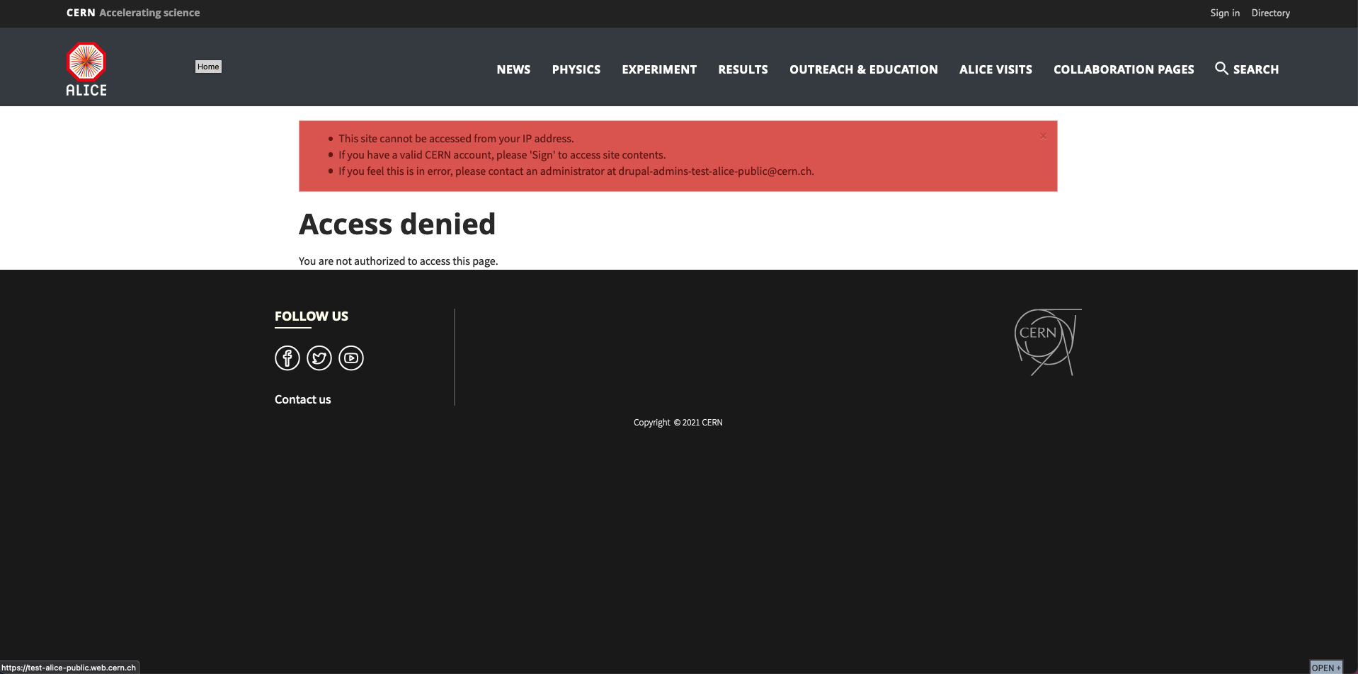
Here the link to the website: [https://test-alice-public.web.cern.ch/
This website aims to replace the following one: https://alice.cern/
And as you see, all the menu links are displayed on the same line.
That’s why I am wondering whether there is a solution to do the same thing/extend the capacity of the menu bar ?
Thank you
Hello Guylaine,
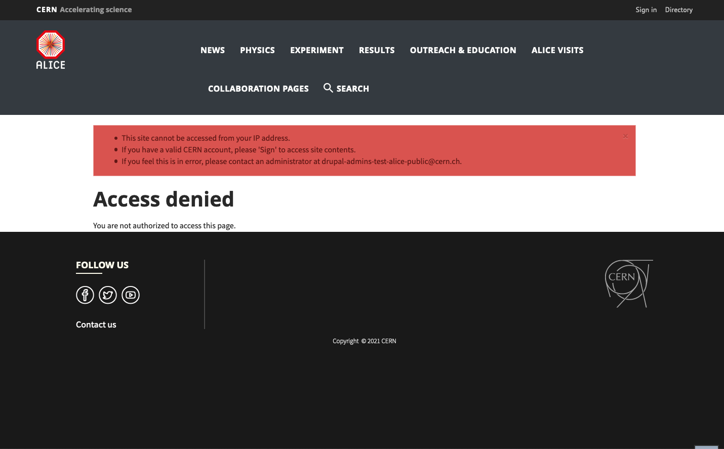
The “two lines” issue appears when the menu is too long to fit in one line. This happens either when the menu items are too long or if they are too many or if they are too many and long. However, the “does not fit” is relative because it depends on the size of the screen you are looking it.
eg. the next 2 images show how it looks like in two different screen sizes:
As you can see in the second one it does not fit. In order to solve it you can either decrease the “words” or even better group them. Eg. I think it is visible that the item RESULTS can be placed under EXPERIMENT since results are part of the experiment. Similarly, ALICE VISITS can be placed under OUTREACH since visits are part of outreach. Also Physics can be placed under EXPERIMENT etc.
I hope that helps.
Konstantinos