I have a problem in my website:
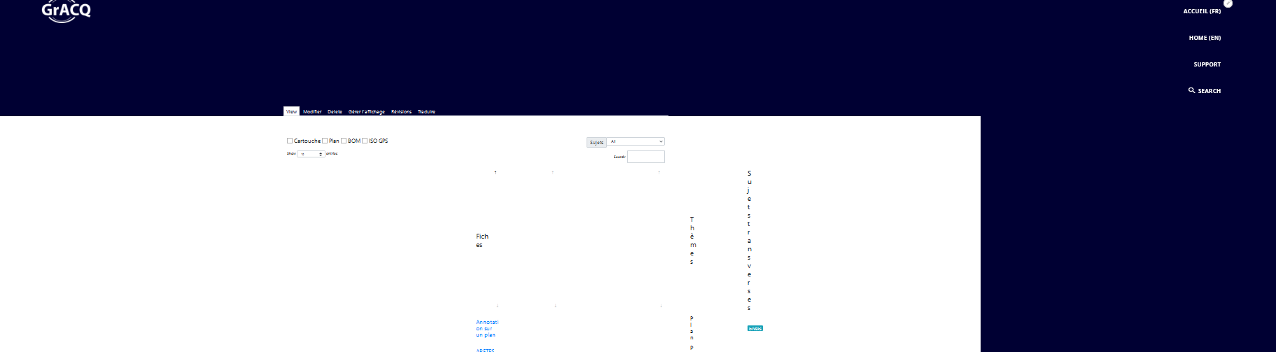
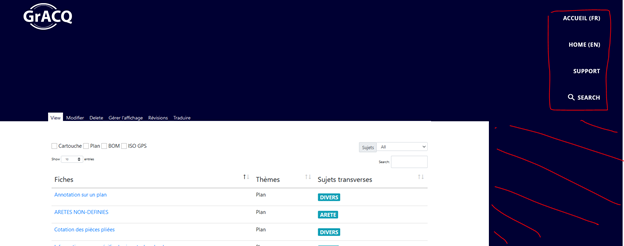
The page concerned : https://gracq-cern.web.cern.ch/fr/tableau-avance
If I insert a table in html in the menu configuration changes.
The menu becomes vertical and the table cannot be extended across the width of the page.
when I remove or deactivate the table, the menu returns to horizontal (my wish is that the menu remains horizontal).
how to avoid this? Is it a bug?
Many thanks
Hey Scmehann,
I hope you are doing good.
I had a close look to your website and found out that the table needs to have some additional CSS with respect to the width and height parameters. Since the content posted is under Content Type : Landing Page and you have a html code that runs to deliver the table on the website. I request you to add the width : 100% so that the table occupies the whole page area like the other contents on your website. Though keep in mind how you have written the html code for the table and accordingly you should write the css for the same.
Apart from that the menu looks fine with the placement of the block in the layout. It is all the CSS that is causing the issue. You can also try out the default table layout available in Drupal.
I hope this helps.
Regards,
Prakhar
Hello Prakhar,
Thanks for your help.
I made several modifications by inserting the width of 100%, but it does not work.
I really think the problem is with drupal.
Can you check please?
Thank you so much.
Regards,
Scharif
Dear Scharif
I used to add <table class="simple-responsive-table"> when I insert a table.
Regards
Almudena
Dear Almudena,
thank you very much for your help.
but the menu remains vertical and the result is like this:
Regards,
Scharif
Hey Scharif,
I tried implementing the same table in my test site and got the same result as yours, the menu appears vertical instead of horizontal. Upon testing it with a new code for displaying a table (Content Type : Landing Page) the results were normal and the menu worked fine displaying the menu items in horizontal manner.
To conclude there is something in the code that is causing the table to occupy the area on the top of the page and thus misconfiguring the menu list. This can be also seen when you inspect the code.
Therefore I suggest to do amendments to the code (most suitably re-design the table). I can certainly help you do that when needed.
I hope this helps. Incase of any further queries do write us back here.
Regards,
Prakhar
Hey,
On working and scrutinising the code I found out that it is the https://cdnjs.cloudflare.com/ajax/libs/twitter-bootstrap/4.1.1/css/bootstrap.css library that is causing the issue with the menu header. There is a class in the library and in the theme that is overlapping and causing the change on the website resulting in the enlarged menu items thus making them appear vertical rather than horizontal.
If we remove the library from the code then we see the table to look like this (refer the Screenshot below)
I will update you here when I have more on this. Possible we will be able to figure out the css and make the table look like what suffices our requirements.
Thanks and Regards,
Prakhar